
Postman Visualizer: More Than Meets the Eye

This is a guest post written by Orest Danylewycz, founder of Dev Odyssey and information security engineer at Westfield.
In the age of web APIs, no other platform shines more than Postman. As the creator of Dev Odyssey, a YouTube channel dedicated to providing quality IT tutorials, I use, explore, present, and teach Postman frequently. Its broad variety of built-in developer tools make it a no-brainer for anyone working with web APIs or other web technologies. In this post, I’ll be highlighting one incredibly helpful feature that’s capable of much more than it looks: Postman Visualizer.
Data itself can seem very bland. It can be difficult to really capture the impact a set of data has just by looking at straight numbers. But when you introduce a visual concept to present your data, thoughts click, your mind gets creative, and you see insights that you would’ve never seen just by looking at plain numbers.
Postman Visualizer is your API visualization companion. With web APIs being extremely popular for working with data, it only makes sense to provide new means to consume it. Because of this, Postman now provides you that capability within its user interface. This addition is huge for both frontend and backend web developers. To learn more about Postman Visualizer, let’s take a closer look at some of these developer use cases, as well as some unexpected use cases that show how Visualizer can also help you consume your custom-built web tools.
Let’s “Visualize” the numbers
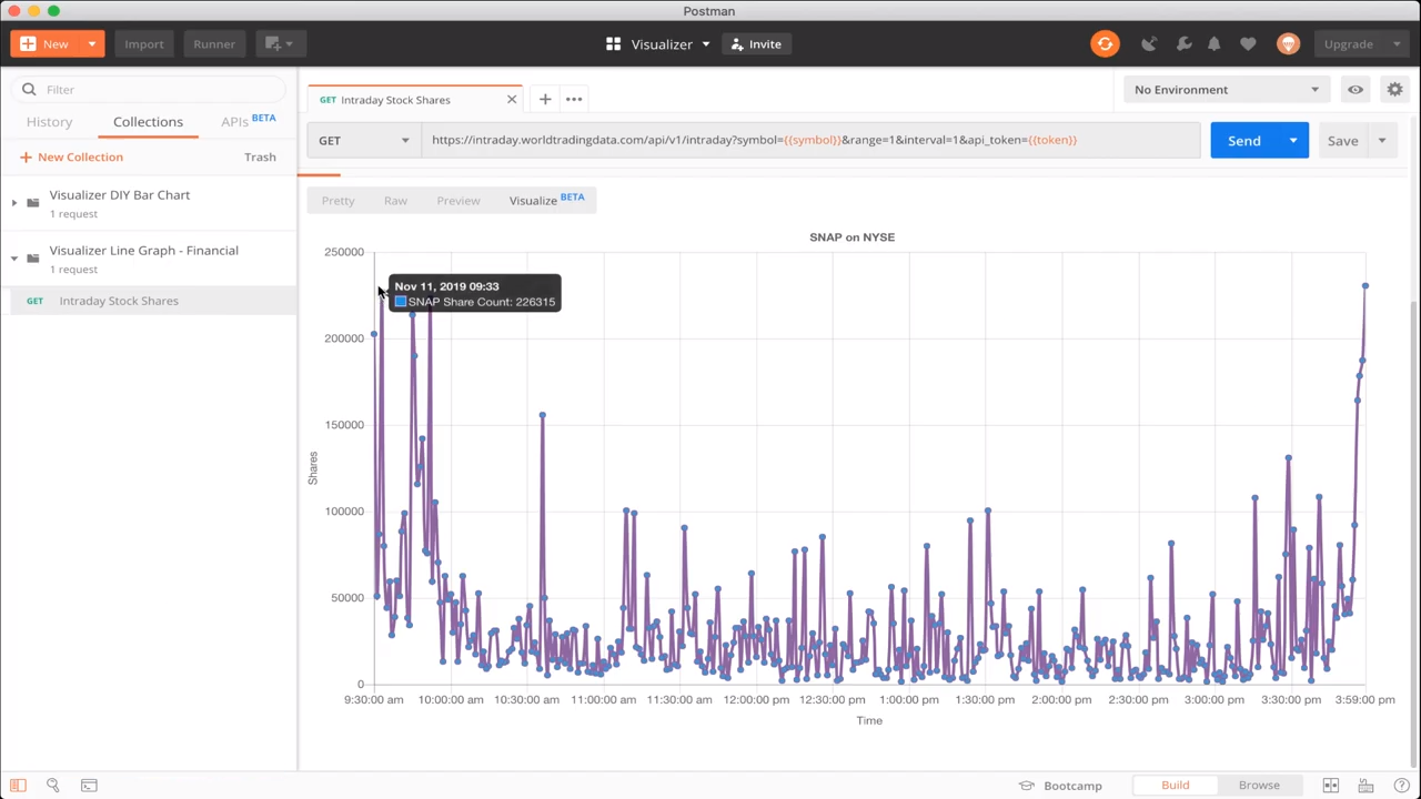
Postman makes it easy with out-of-the-box Visualizer templates. Using powerful Javascript libraries such as Chart.js or D3.js shows how you can make meaning from the data you get from your APIs. When you provide more context to these visualizations, you gain insights that have implications far beyond numbers. In my demo video How to Visualize Data in Postman, I show how we can monitor how stocks are performing in the stock market over time. Sure, you can get this information from brokerages, but when you have the raw data, you can create visualizations that go farther than the standard ones you might otherwise see. This visualization is powered by Chart.js and World Trading Data, now MarketStack. Using this information with Postman Visualizer, you can make better stock financial visualizations. Even better, this can be the start of a web app that users can utilize to make better financial decisions in the stock market. Check out the Postman template for this line graph here.
Using Visualizer when testing
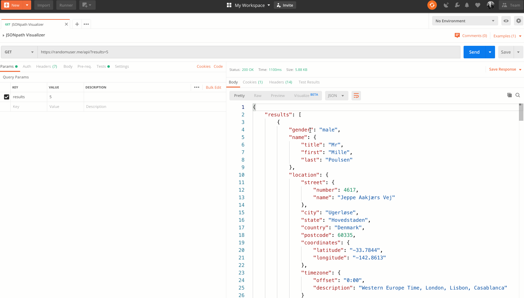
While the last example is heavily based on a generic visualization use case, this next example goes beyond that. As a developer, the initial code you write often isn’t perfect or immune from bugs. Think of it as being like a rough draft. The best way to validate it is to test it. When dealing with web APIs, data is often represented in JSON, and even still, XML. Usually, these APIs return loads of data, and it needs some sifting in order to get what you really want. Developers usually tackle this with JSONPath syntax or its predecessor, XPath, which is XML based.
// Example JSON Object
{
      "name": "Orest",
      "youtube_channel": "Dev Odyssey",
      "tools": [ "Postman", "Visualizer", "Scripting" ]
}
// Example JSONPath for Object
$.youtube_channel // Dev Odyssey
$.tools[0] // Postman
Just like writing the first version of code, writing your JSONPath query or XPath query the first time is also usually never right. But it’s validated in the same way, by testing. Well, wouldn’t it be convenient to test your JSONPath and XPath right against the result of your request in Postman? With Visualizer, you can do that—with Danny Dainton’s JSONPath Visualizer template, and my XPath Visualizer template making it easy. In my demo video How to Filter Data with Postman Visualizer, you can see both of these templates in action. You can create your syntax on the fly and test it against your response right away, decreasing your development time.
Thankfully, this helpful function is possible because Visualizer is effectively a web browser embedded in Postman. Meaning, almost anything you can do in a web browser, you can probably do in Postman Visualizer.
Time for Visualizer web apps
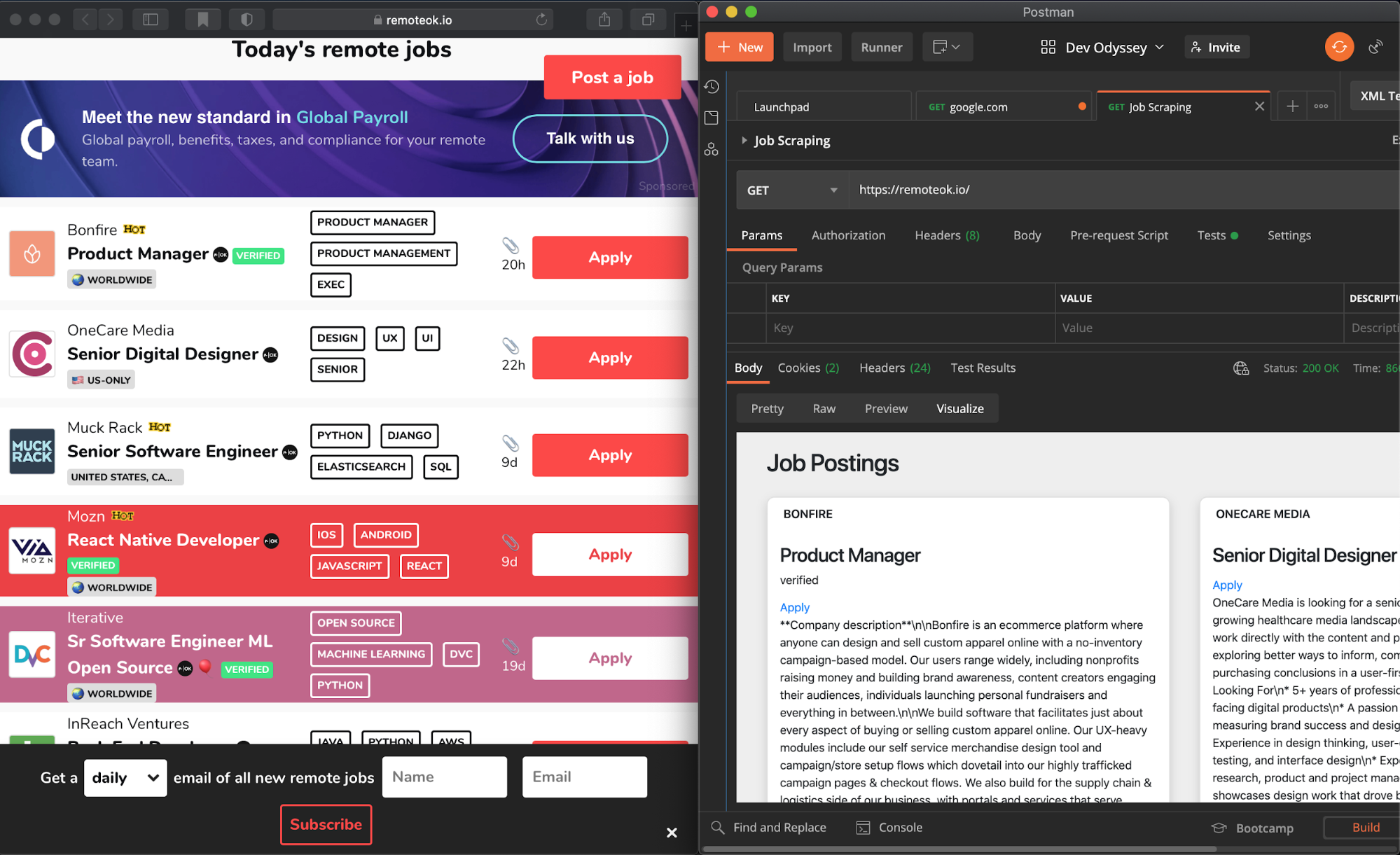
To add to that example, we can create other Postman-based “micro” web apps. Let’s take a look at web scraping. While this practice requires certain precautions, you can scrape website data to prepare for your own analytics, or for your own monitoring purposes. My first exposure to web scraping came from a colleague at my first job. Here’s the story: My colleague created a bash script that went to a website, parsed out the price of a pair of shoes he was interested in, and monitored the price until it dropped significantly. Once it dropped enough, my colleague purchased them. We’ve certainly come quite a way since then, and there are dozens of tools that provide that kind of capability. Within Postman, you can do your own web scraping, using the built-in library, cheerio.js, in Postman’s Node.js sandbox.
In the Tests section of your Postman request, you can parse out the response of a web request that returns HTML, and you can scrape the pertinent data out for your personal use. In the Web Scraping with Cheerio.js and Postman Visualizer video, I demonstrate this using the website remoteok.io, a website where you can find remote jobs. Remote work is certainly more popular than ever, and with this web scraping example, you can pull out the jobs available from remoteok.io and display them in a nice card-like fashion.
This is just the beginning
As we’ve learned from the three examples above, Postman Visualizer is a great way to see data and make more meaningful sense of it—but it supports so much more than just seeing charts and graphs for data. Postman Visualizer can also be used for testing and creating micro web apps, serving as yet another way Postman empowers you from the beginning to the end of your software development lifecycle.
Ultimately, Postman Visualizer is built to help you act on data, and not just look at it. Check out this quick tutorial on the Postman Learning Center to get started with Postman Visualizer today, and watch this Postman Visualizer Demo video:
Learn more about our guest blogger program and submit your idea here.


Nice write up Orest