
How to Improve an API Ecosystem with Mapping
APIs are created and consumed by organizations of every size and in every industry. The different technology stacks, team maturities, and usage expectations create a complex API ecosystem that only continues to grow. Whether those critical assets are left fragmented and ad hoc or carefully managed can be the difference between just surviving and thriving in today’s unpredictable business environment.
The purpose of the Postman Open Technologies program is to improve API practice across the industry. In that role, I frequently coach API leaders tackling unique management and governance problems within their companies. Before promoting a direction, all parties must understand where we are and what destinations are possible. A map helps simplify an overwhelming number of technologies, techniques, and ideologies into something approachable and with a clear way forward. Ultimately, maps provide key insights so that having a conversation about an ecosystem’s strengths and weaknesses can be had. Based on my experience and keeping with the Postman Open Technologies ethos, I’m excited to share an effective mapping process so that others can benefit from the work.
The 10 pillars of an API ecosystem
Managing an API ecosystem requires a different perspective than overseeing a single API. In O’Reilly’s Continuous API Management (or CAM) book, authors Mehdi Medjaoui, Erik Wilde, Ronnie Mitra, and Mike Amundsen define 10 pillars, or attributes, of an API ecosystem. Those pillars are:
- Strategy: Understanding why you want to build your API and how API success relates to business success
- Design: Decisions related to how the API will look, feel, and be used
- Documentation: The work related to communicating intent and enabling self-service for an API
- Development: The technology tools, frameworks, infrastructure, code, and processes that enable an API
- Testing: Decisions on not only what to test, but how to test it
- Deployment: The work of moving the implementation of an API into an environment where users can use it
- Security: Protecting the uptime of the system, mitigating threats, and implementing data oversight
- Monitoring: Making run-time performance information available, accessible, and instrumental in future refinements
- Discovery: Increasing the likelihood of integration, applying to both design and runtime
- Change Management: The ability to incorporate new learning efficiently without breaking existing integrations
A tremendous amount of work goes into creating an environment that can successfully produce sustainable, productive APIs over and over again. The CAM pillars help organize the decisions that need to be managed or governed into tidy, understandable groupings.
Each pillar affects overall ecosystem health. However, attempting to improve every area at once is a recipe for muddled focus and disappointing results. Furthermore, different companies may require attention on other things; it is far better to spend limited resources on the most impactful, relevant areas first.
Knowing which move to make next requires understanding the landscape. To do this, we can create a map.
Mapping an API ecosystem
A map does attempt to convey every feature and nuance of an environment. Instead, it presents a simplified, pared-down representation that makes traversing an otherwise complex space approachable and understandable.
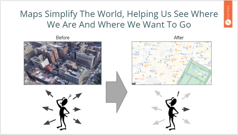
Like the world, modern software landscapes are complex. Mapping an API ecosystem simplifies all the pieces that contribute to an API-first world, helping the organization identify areas of opportunity and improvement.
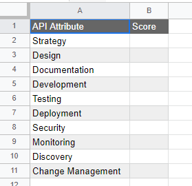
To begin, take any available spreadsheet application and list the 10 pillars in a column (or copy this API Ecosystem Mapping Spreadsheet I’ve shared). In the Score column, rate your organization’s performance between zero and five for each corresponding pillar.
Use the following criteria while scoring each pillar:
0-1: Just starting
- API creators and consumers either are unaware or dismiss the importance of this pillar
- There is a lack of understanding of how improvements along this axis are beneficial to the organization
- API creators and consumers are unaware of goals or peer efforts along this axis
- There is no connection between improvement along this axis and business strategy
2-3: On the way
- Improvement efforts are either inconsistently implemented or result in unpredictable results across the organization
- There is a sense that things could be better, but what better means or how to get there is vague or a work in progress (WIP)
- API creators and consumers are aware of peer efforts, but there is no formal process for observing usage, identifying standouts and problem areas, and evolving practice
4-5: Maturing
- API creators and consumers have a well-communicated set of KPIs/OKRs for the given axis
- An improvement initiative connected to business strategy is already underway and regularly reported on
- API participants can clearly articulate the importance of a given axis to business success
With an understanding of the scoring, it is now time to fill in our simple spreadsheet. Let’s say we’re looking at assigning a score for security. If security is something that either isn’t thought about or left up to ad hoc efforts, then we may enter a value of 1.
At this stage, it is valuable to remember that there is no “right” answer. If something receives a score of 1 or 2, it is less important than the act of carefully considering how each pillar is internalized and expressed within your API ecosystem.
Of course, a map is more than just topology amounts and X, Y coordinates. Once we have our numbers, it is time to visualize our API ecosystem.
Visualizing an API ecosystem map
Once we’ve rated each pillar, it is time to visualize the landscape! Radar plots allow us to simultaneously compare several axes on a single graphic (or “spider plots”). If you’re using the template I mentioned above, the chart will fill in automatically after each entry is added. Otherwise, see your own spreadsheet application’s documentation for how to generate a radar plot.
With this visual representation or map, we can begin analysis. What are the API ecosystem’s strengths? Weaknesses? Is performance in one area inhibiting improvement in another?
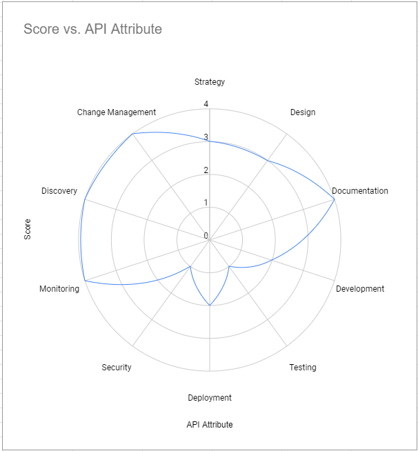
The API program emphasis appropriate for one organization may not make sense for another. For example, in a company beginning a program, API “Discovery” may be very rudimentary; in these cases, the small number of items can easily be handled with a circulated list. In another case, like a company in a highly regulated industry, the “Development” dimension may score high because sophisticated review, sign-off, and certification tooling exist.
The map author should identify the hills and valleys shown in either case and ask if the current state best serves the business.
Unlocking the true benefits of the map
Identifying strengths and weaknesses is one thing. However, the true benefit of the mapping process is the conversations that happen when comparing maps. If you score security at a 5, but your technical lead only scores it a 2, there’s tremendous value in unpacking why that gap exists. Are there assumptions that need to be addressed? A blind spot that hasn’t been communicated?
Sharing maps can help surface these issues and promote better organizational alignment, even before improvement efforts begin.
Conclusion
Once an API ecosystem map is created and the conversations have been had, an organization can begin optimizing its API program. Whoever is responsible for that shared ecosystem health—whether that’s the tech leads, an architecture guild, or even a dedicated Center of Enablement—can institute the necessary change activities to improve practice along one or many pillars. That change moves an API ecosystem from one of coincidence to groomed, focused intent.
Simultaneously improving all areas of an API ecosystem can be difficult. Focusing limited time and energy on the areas of most significant impact is a better strategy, and API ecosystem maps can help identify those areas more efficiently and effectively.


What do you think about this topic? Tell us in a comment below.