How Postman Designers Developed the New Universal Search Feature
Ask anybody for an example of a search experience on a digital platform and they can easily reel out a long list. It would start with the friend we most depend on, Google, and could end up with examples inside simple apps like Notes. Today, the search function seems like such a common workflow that you might not think it requires any design put into it.
During the past few months, Postman designers have really questioned this belief while reimagining the search function in Postman—starting from a blank canvas to try to create the ideal user experience. In the end, designing a universal search feature—which pulls up search results from across the entire Postman API Platform—turned out to be a super exciting UX problem to solve. It became the perfect example of an iterative design journey we now want to share with you.
How we started the design process
At Postman, we always begin our design process by doing a deep dive into the jobs-to-be-done framework. It helps ground us with the most important bit of why we are doing something. For the new search function, we were ultimately trying to solve for one job:
When a Postman user is working on a project needing an API resource, they should be able to find the most relevant search results to help them complete their work.
This seems fairly straightforward, doesn’t it? But let’s look at the following case:
Imagine a large organization with a team of more than a thousand people working on Postman. This can easily translate to hundreds of APIs found in multiple different workspaces for this team. Different users may search for an API looking for many different types of resources—a documentation to understand all that the API can do, or a collection of requests to play around with to see the responses. And it doesn’t end there. Today, API development is innately a collaborative process, and developers often start a project by looking for public APIs for their use case.
This example brings up the two important questions around the search journey that provided the foundation of our UX decisions going forward:
- Does the Postman user know exactly what they are searching for? For example: “I want to get to the Publishing API one of my teams is working on.”
- Does the Postman user want to explore a wider range of possible resources related to what they are searching for? For example: “I want to see what COVID-19 resources exist for me to use.”
The search experience in Postman essentially had to accomplish two major goals:
- Navigation: How can we make a user reach the result they are looking for as soon as possible, to increase efficiency across Postman? This result might be a private API they quickly want to navigate to, a team they heard about and want to view, or even a public workspace from which they can fork the API they need.
- Discovery: How can we help users discover the most relevant content they need from across all of Postman? This could mean exploring public APIs based on topic, specific endpoints by a popular company, or examples of collections related to the latest global problems.
How it evolved to where we are today
Stage 1: The MVP
For this feature, we were building up from ground zero because we’d never had universal search in Postman before. At this stage, the main aim was to build a simple first version that would serve as a strong foundation to validate and iterate upon.
Here are a few of the major tips we learned that are helpful for this stage of the design process:
- Have a clearly defined goal: The need for the entire team to be on the same page with the long-term intent of the product is critical. Defining the job to be done by the user helps everyone stay consistent with where we aimed to reach.
- Have a mindset of iterative design: Designing a minimum viable product (MVP) always means that you will keep learning as you design. Every iteration could be only a small step towards your eventual goal—it’s okay to have limitations you are aware of, as long as you have a vision of the bigger picture. Iterative design isn’t about just building new prototype versions but constantly collecting actionable feedback on what exists. Feedback can be obtained by demoing a feature to stakeholders, testing with the target audience, or constantly validating real-world use cases once something is released.
- Be mindful of your hypotheses: It’s really easy to make decisions based on internal assumptions due to the lack of data validation at such a stage. At Postman, we are always experimenting with quick MVPs. But we also understand the need to document every assumption, and we use user feedback and data to validate those assumptions.
- Leverage cross-functional brainstorming: At an MVP stage, especially for a feature like search, looking cohesively through the lenses of product vision, engineering frameworks, and UX goals is extremely important. Having multiple teams ideate together helped us align our eventual north star for the product while shipping the MVP as soon as possible.
Stage 2: From functional to useful—embracing constraints
Constraints. There are tons of articles talking about the need to embrace constraints as product designers. Of course, it’s easier said than done, as the designer in you always hopes for that ideal state where you can provide a seamless experience without any friction. Wouldn’t the best search experience be the one where the first result is so perfect that nothing else mattered?
Working within constraints is what defines a good design process, and this was the real challenge we had to learn from. When we had our first version of universal search ready, we had designed it with one basic flaw that made it functional but not really useful: We assumed that all the filtering, cross ranking between entities, understanding of contextual signals, etc.—essentially all effort—would happen on the backend, and that the user would only see the final perfect set of results.
Of course, we came to realize that there was a reason Google never mixed image or video results within webpage results for the longest time, until they had an extremely nuanced understanding of cross ranking. While testing our first version of universal search, we realized more often than not, that our algorithm didn’t show the perfect results in the drop-down in the first shot. Also, due to the way we had designed it, users had no way of adapting these results, and this lack of control affected the usefulness. All tooling to clarify intent (through filtering, sorting, etc.) was only on our detailed search results page, but users lost trust in search even before getting there. This was especially true for navigational use cases, where I knew exactly what I was looking for.
We used the above insights when iterating version 2.0 of universal search. After lots of discussions, testing, research, and analysis, these are some of the main design changes we made:
- Defining scope: The Postman universe is fairly complex, especially for users from larger teams. Universal search allows a user to look through all private and public data they have access to, and that’s what makes it so powerful. However, at the same time, it is important to cater to specific use cases: a user may want to narrow the search scope to only their team data or to only the Public API Network. Clearly, calling out the default scope and allowing for easy switching became an important function.
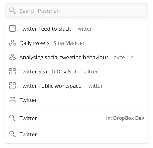
- Filtering by element type: Universal search not only helps users find APIs but also workspaces, collections (of requests), and teams. Although we knew there was great value in seeing all these types of results when exploring new content, there were a lot of use cases where the user was sure about what element type they want to look for. Here, filtering by the element type could show them more useful results.
- Making informed decisions: In the first version, the search drop-down was extremely minimal, with limited information shown to the user. In many cases, it was hard for a user to decide whether or not to click on a particular result. The largest challenge here was to provide relevant metadata to aid choice but still keep the cognitive load limited in order to allow for scanning and quick consumption. So, we made various changes, including adding icons to represent whether an element has public, team, or personal access, and workspace names for collections.
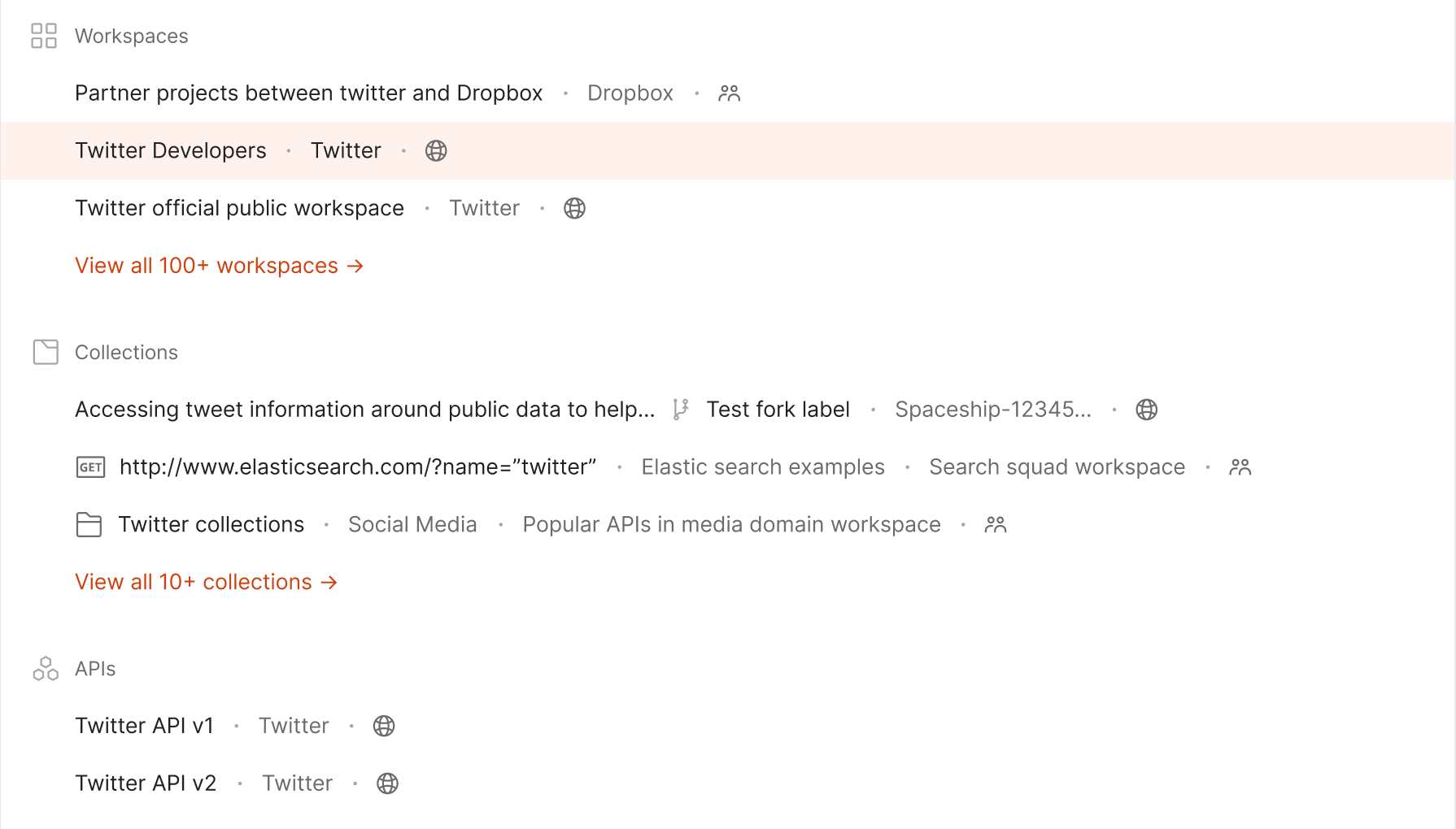
- Using keyboard navigation: For a developer persona where keyboard navigation was a major use case, it was really important to think through and detail the interaction patterns via the keyboard keys to: change scope, apply filters, choose a result, and more. Defining every edge case meant that this should work smoothly—from triggering a search to finally landing on the destination workspace.
Stage 3: Collecting feedback from real users
Having spoken about iterative design, our product is nowhere close to a final version because we continue to refine the universal search feature today. At this point, we are using the current search as a source for qualitative and quantitative data around user behavior and attitudes. It is important to not only verify design decisions but also to identify new potential needs, like intelligent default settings and personalization. Listening to our customers has always been what helps Postman grow, and our design team continuously collects detailed feedback through various channels:
- Our developer relations team gathers qualitative feedback directly from our customers.
- Our moderated usability tests find user pain points and uncover opportunities to improve the user experience.
- Our product and design teams monitor analytics for usage data such as: search queries, entry points, and filter usage in order to understand behavioral patterns and anomalies.
- Our Twitter, Github, and discourse channels organically provide user feedback.
As with every Postman feature, we are constantly researching what works and what doesn’t when it comes to search. With the recent release of the Postman v8 desktop app, universal search is now available to millions of Postman users, and we’re excited to hear more feedback as we keep iterating on our design.
Watch universal search in action
Check out this quick video demo of Postman’s universal search:


What do you think about this topic? Tell us in a comment below. You can also give product feedback through our Community forum and GitHub repository.