
Spread the News, Not the Virus: Creating a Personalized COVID-19 Alert System

This is a guest post written by Carson Hunter, software developer at Metadata Technology North America.
Over the past few months, I have spontaneously become a connoisseur of COVID-19 data and reporting. In my day-to-day role as a backend software developer at Metadata Technology North America, I usually work on systems built to surround data with metadata, and I don’t dive too deep into any one particular topic. But since late March, when my team decided to focus on providing high-quality coronavirus data through our Rich Data Services API, I’ve spent a lot of time reading reports, hunting down datasets, and getting a crash course in epidemiology.
Along with all of the big players in coronavirus data, such as the COVID Tracking Project and Johns Hopkins University, I’ve scoured every U.S. state’s health department website, marveled at some third-party reporting efforts, and followed case counts in other sectors (universities, school systems, sports, and more). Plus, as a local government nerd and generally nosy person, I’ve been really interested in how policy bodies are using COVID-19 data to make decisions—and how they are then communicating those results to the public. In addition to all of this, I’ve also been collaborating with the Postman team on advancing the Postman COVID-19 API Resource Center and its COVID-related API collections.
While doing so much pandemic research, one common reporting mechanism I kept seeing pop up was a color-coded scorecard system using green, yellow, and red to indicate the real-time ratings for hospital resources, current case counts, and testing. This initially seemed like a useful tool for getting information across and monitoring the situation, but then I noticed numbers going up and indicator colors staying green. I began to wonder, “What are the benchmarks for requiring a change to the next warning level?” When I dug further, I found that sometimes these benchmarks weren’t public or were just hard to find.
Then it occurred to me that I could easily make my own monitoring system focused on the indicators I wanted, with the benchmarks that mattered to me. And so began the process of creating my own personalized alert system that I’ve used to track the growth rate of positive COVID-19 cases in San Francisco.
Let’s walk through how I did it. If you want to follow along, you can import the Postman Personalized COVID Tracking Collection and use it as a basis for crafting your own alerts.
1. Set your location
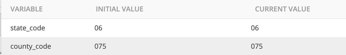
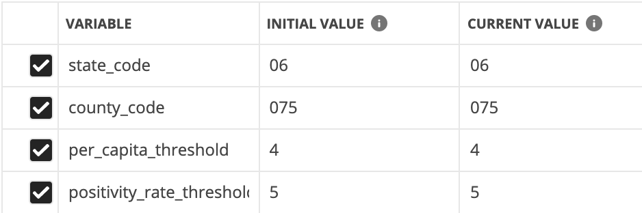
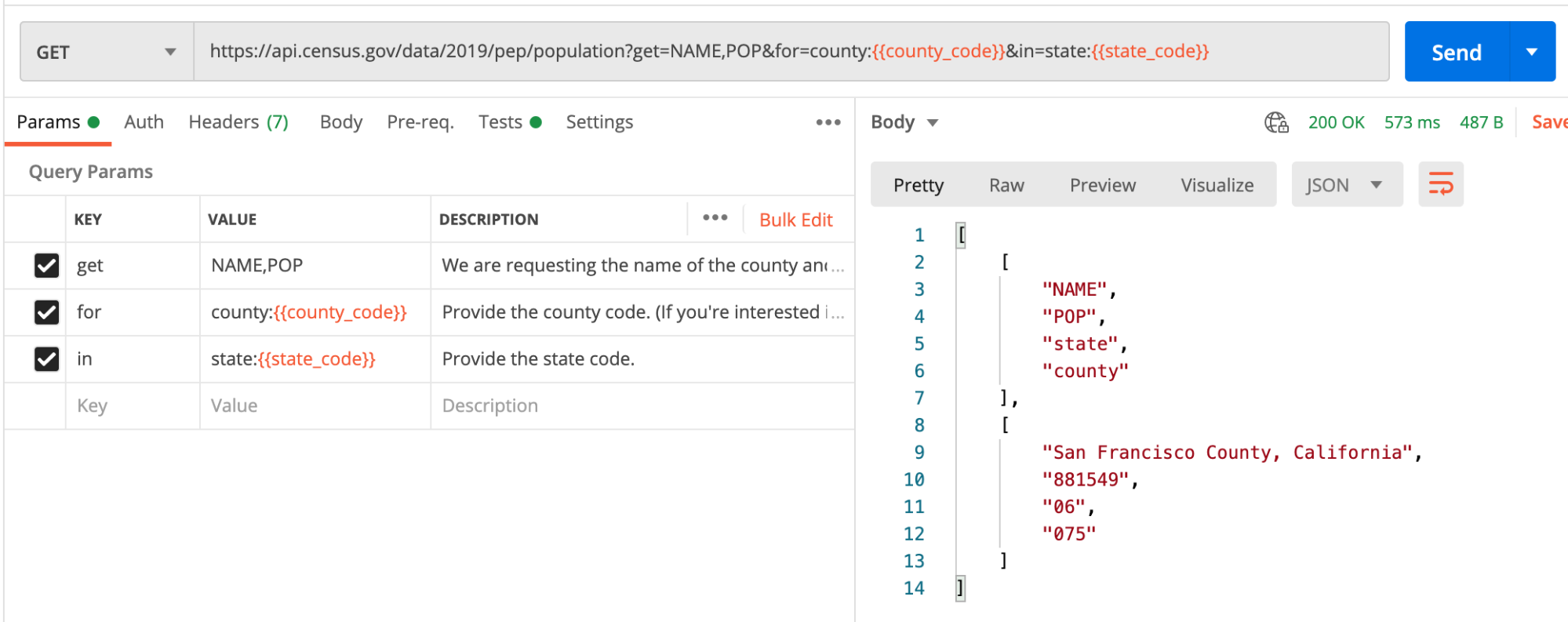
To make this alert system generic and easily configurable, all of the user-defined variables are kept to an environment. The state_code and county_code variables refer to the FIPS codes, which are identifiers used by the U.S. Census Bureau and other organizations to classify U.S. states and counties. To personalize this to your location, you’ll need your two-digit state code and three-digit county code. Plug your FIPS codes into the environment. I’ll be using San Francisco County, California as the location for this collection, represented by the county code 075 and state code 06.
2. Choose your measures
As you have probably seen, there are many numbers being calculated to monitor the spread of the pandemic. I chose to focus on measures surrounding positive tests, but you can add in more data for testing, hospitalization rates, resource availability, or whatever data you can get your hands on. I’ll be measuring:
- Positive case count: I’ll be tracking both the daily cases per capita for the county and comparing the county’s average positive case counts from week to week. Though the raw data of case counts is not easily comparable across counties due to varying populations, I find it helpful to monitor the trend of cases within a county.
- Positivity rate: This is a measure of the total positive tests divided by the total number of tests for a given time period, and can tell us information about the spread of the virus and how widespread testing is. I’ll be looking at the positivity rate at the state level: both for the previous day’s tests and a rolling average over the past seven days.
3. Choose your benchmarks
- Positive tests per capita: I set my
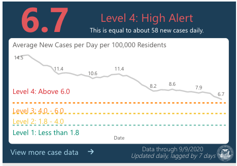
per_capita_thresholdvariable benchmark at four positive cases per 100k people per day. For some context, DataSF has a warning system monitoring the average number of new positive cases per day per 100,000 residents, with a goal of reaching 1.8 per 100,000 per day. At the time of writing, the trend line is about to enter Level 3, so from an alert standpoint, I’d like to know when it gets to Level 2.
- Positivity rate: I set my benchmark at 5% because the WHO recommends states strive for 3-12% positivity, with 5% indicating that the pandemic is under control. This will be our
positivity_rate_thresholdvariable.
4. Choose your sources
I will be using the Johns Hopkins county-level dataset and the COVID Tracking Project’s state testing information for my case and test data, and the Census API for gathering population counts. I’ll be querying the first two datasets through the Rich Data Services API, which provides some great tools for subsetting just the data you need (preventing data-wrangling later on).
Now, for the fun part.
5. Calculate the number of positive tests
To calculate per capita measures, we first need a population count. A quick request to the Census API querying 2019 data for our selected state and county code will give us the information we need.
Heading over to the Tests tab, we’ll stash this number in an environment variable and be on our way.
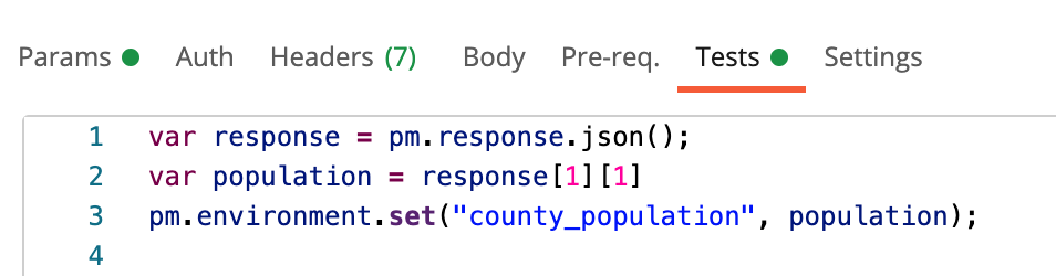
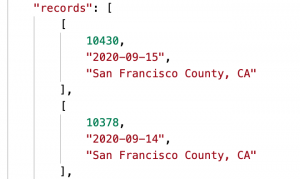
county_population environment variableTo calculate the number of positive tests, I use the Johns Hopkins county-level data. I return the cumulative count of confirmed cases and limit my results to the last 14 days. I combine the state_code and county_code variables we defined earlier to get the five-digit county FIPS code.
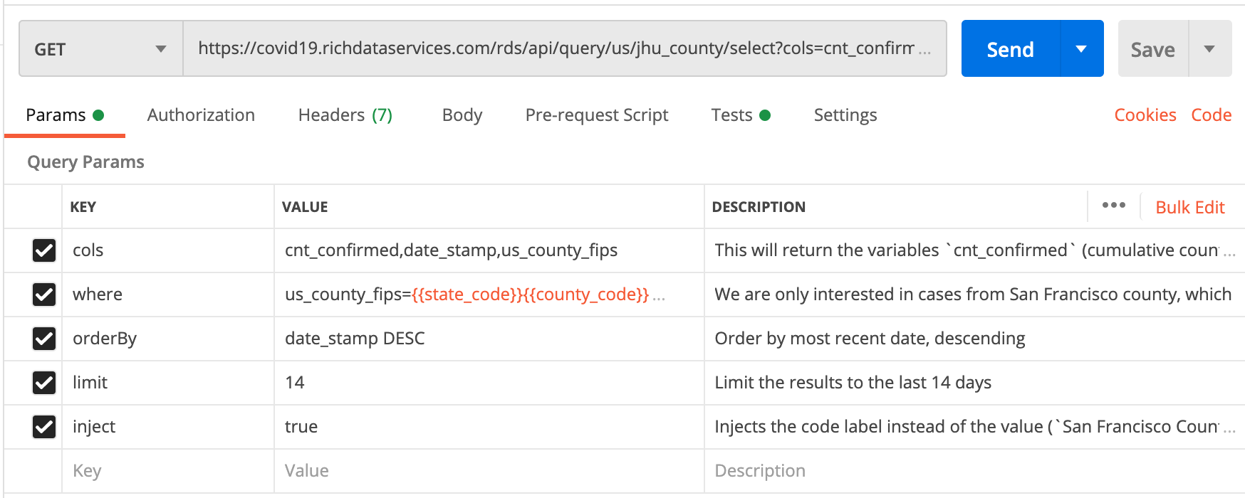
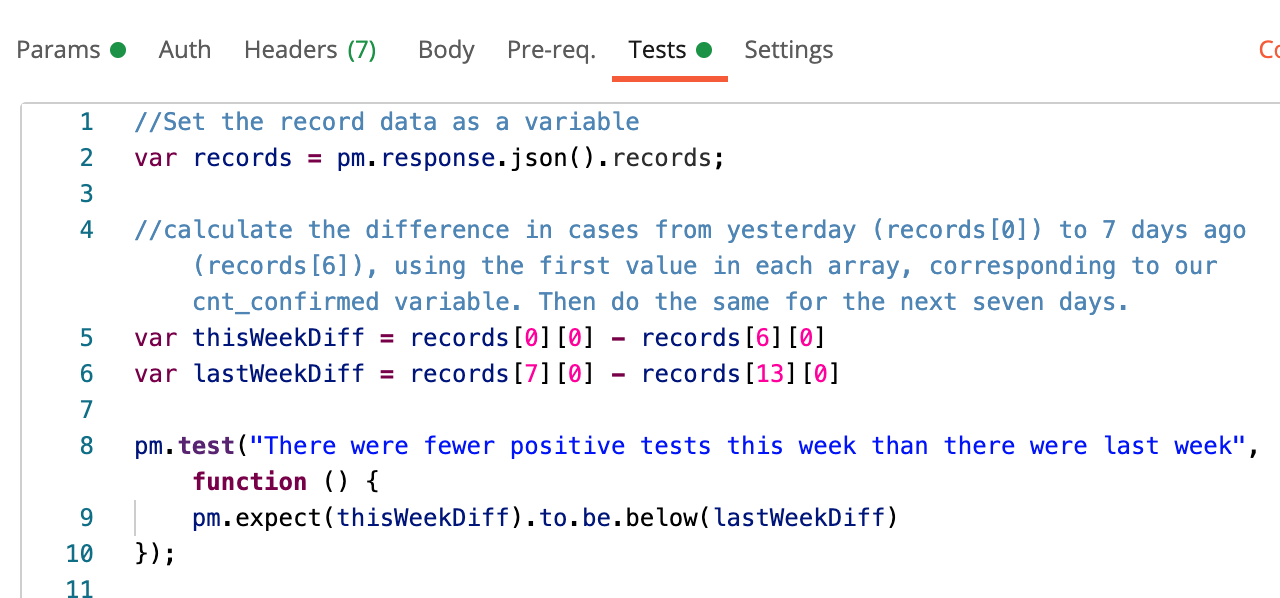
The returned data has the three elements in the array representing the three columns (“cols”) we asked for: cumulative count of confirmed cases, the date the cases were logged, and the county.
For the first test, I compared the number of positive tests for the past seven days to the number of positive tests in the preceding seven days to monitor how cases are trending from week to week.
For the second test in this request, I calculate an average daily number of positive tests and compare it to our per_capita_threshold value determined earlier. I take an average of the total new positive cases reported in the past seven days, divided by the county population, then multiplied by 100,000.
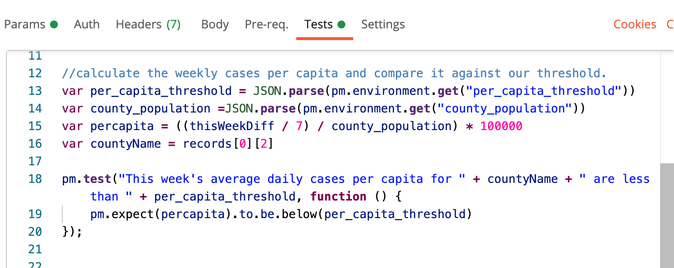
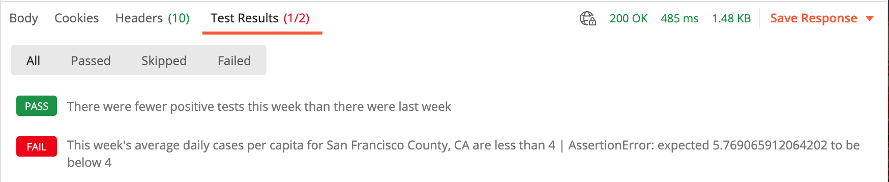
When we send the request, we find out that while the average daily cases per capita are still above our threshold, positive cases overall are trending downward. Progress!
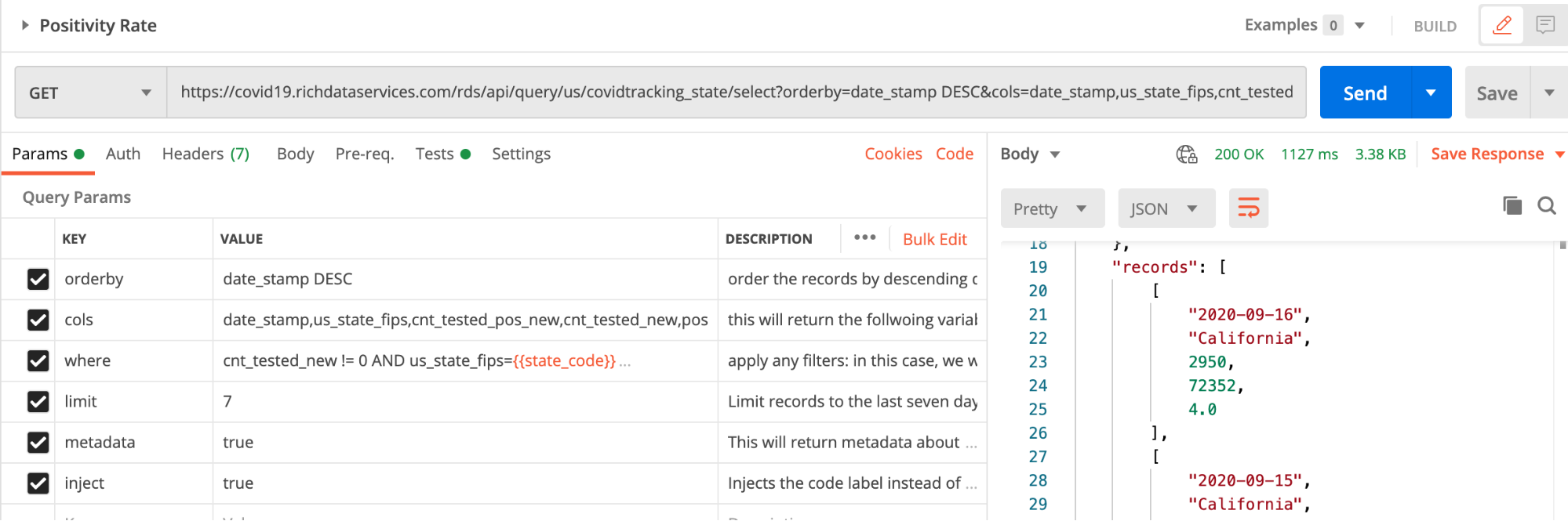
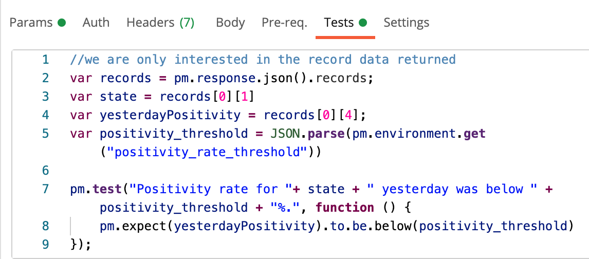
6. Calculate the positivity Rate
Here, we are using data from the COVID Tracking Project to look at positivity rates. Similar to the setup of the previous request, this one returns a record with the date, state, number of new positive tests for that day, number of new total tests for the day, and a calculated variable for positivity rate (new positive tests divided by new total tests, multiplied by 100.). We will limit the data to the last seven days, with the most recent returned first.
In the Tests tab, the first test simply grabs the positivity rate from the most recent record (yesterday) and compares it to our positivity threshold variable.
For the second test, we will calculate an average weekly positivity rate, giving us a more contextual view of the data and smoothing out any spikes that may occur from day to day.
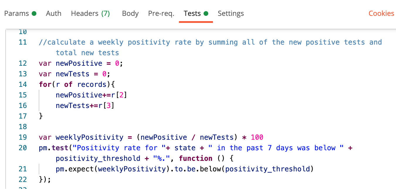
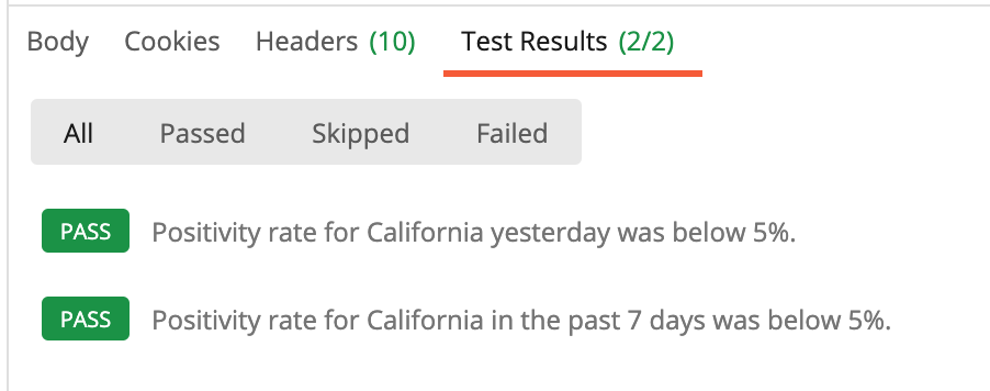
And when we run the test…we see that California’s positivity rate is within the recommended range. Excellent.
7. Integrate and communicate
Now that we know that our tests work, it’s time to put them to work for us.
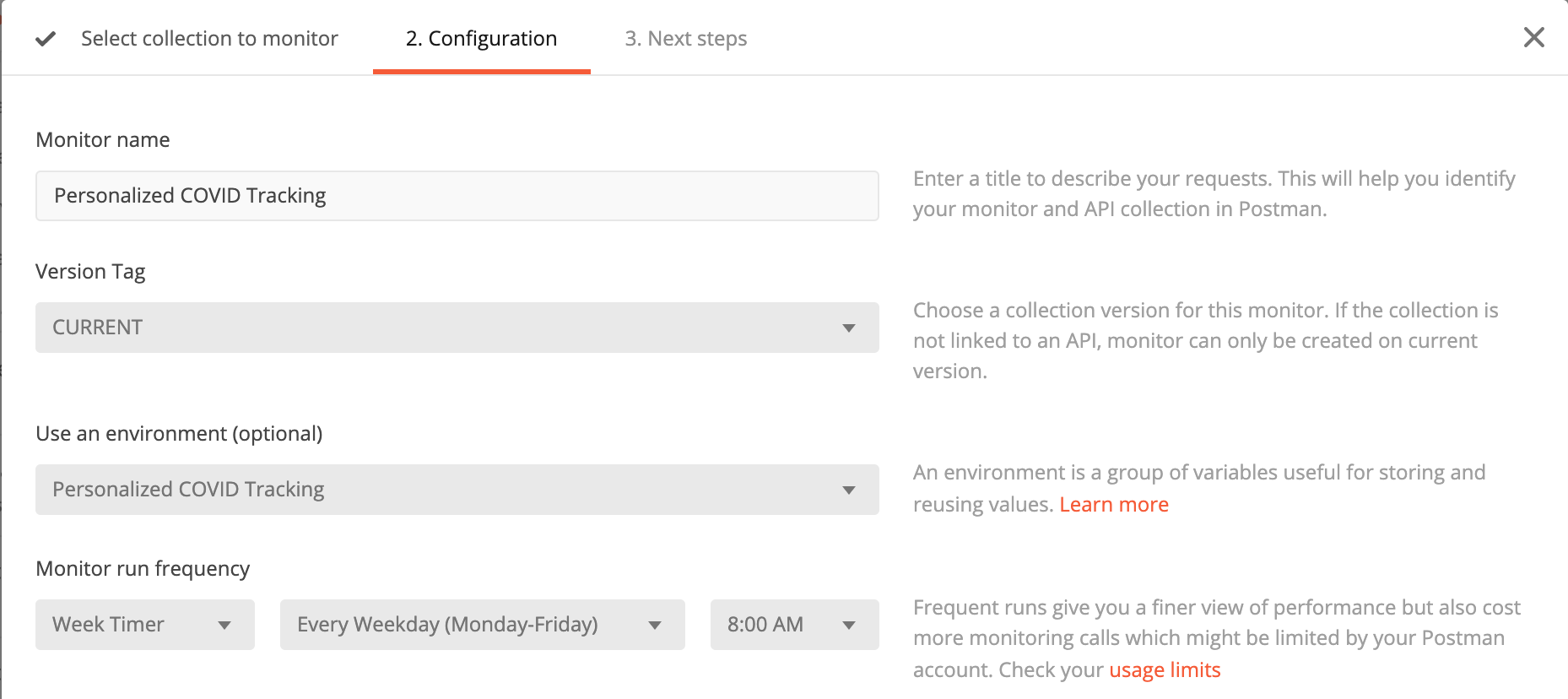
The final step is to set up a collection monitor so that we can get a daily briefing. From the collection menu, I select “Monitor Collection,” fill out the menu above (making sure to include the environment we populated), and set it to run every weekday at 8 a.m. I then set up a Slack integration to send my monitor results to a designated Slack channel. To test that everything is set up correctly, I manually run the monitor and wait for the sweet sound of the Slack knock.
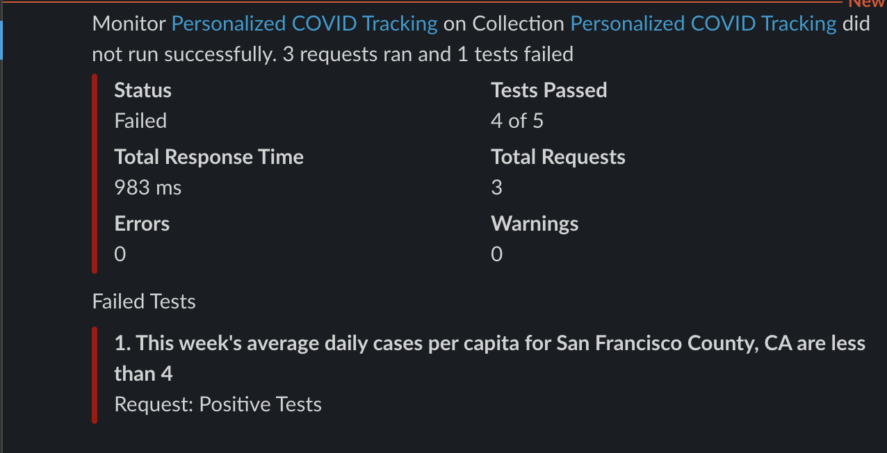
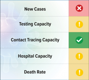
A few seconds later, I receive the above report noting a failed status, but this is exactly what I want. The results show the expected number of failures in a personalized COVID update sent right to my Slack workspace.
What now? Spread the news
Now that you have the power to create your own personalized news briefing, the next steps are up to you. Since all of the location configuration is externalized in the environment, you can easily create separate monitors using different environments to track conditions in other locations. So whether it’s keeping tabs on a hopeful vacation destination or on your hometown as you decide your holiday plans, you decide. And with the ability to integrate with webhooks, you can take it further with automated syndication of your findings: Spread the useful news by posting a tweet whenever positive cases start to rise, or text your relatives when the positivity rate spikes in their town.
For more inspiration on pandemic-related APIs, check out the newly revamped Postman COVID-19 API Resource Center and browse the wide range of data sources and visualizations. And let me know when you’ve set up your own fully automated Postman alert system—I’ll be your biggest fan.
Do you have your own experience or tips to share with the Postman community? We want to hear from you. Learn more about our guest blogger program and submit your idea here.

What do you think about this topic? Tell us in a comment below.