Introducing Postman v8: A Whole New Desktop App Experience
Despite all its challenges, last year was a remarkable one for Postman. We, just like many of you, faced adversity, but we prevailed to make some massive strides in 2020: We recently launched Postman on the web, going back to our roots starting out as a web-based utility (a Chrome extension); we launched the private API Network, in addition to the Public API Network, to enable the search and discovery of APIs both from within and outside your teams and organizations; last but not least, we beta-launched Postman public workspaces, which are changing the way collaboration happens on APIs. All in all, it was a very momentous year for our API platform.
One of the principles that drives us here at Postman is the continuous enhancement of our product for a better end-user experience. Today, we are excited to share that we are taking another big step in this direction with our desktop app’s latest release, Postman v8.
This newest version of our desktop app gives you a consistent, better user experience. It has universal search across all of Postman, including the public and private API networks, plus you can work on public workspaces (currently in beta) directly through the desktop app. This means that the Postman desktop app and Postman on the web are now equally empowering—which one you use is a matter of preference for your workflows.
What’s new in the Postman v8 desktop app?
Here are a few notable things about the new user interface in the Postman desktop app.
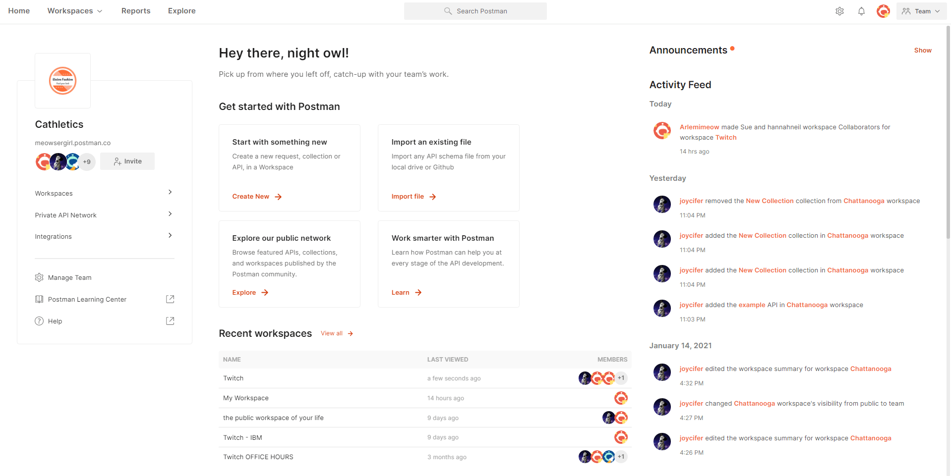
- Home tab provides an overview of everything in Postman: Postman v8 introduces a new Home tab on the top navigation bar that lets you know all the things you can do and also see all that things that are happening in your Postman instance. It is designed to enable better collaboration on your APIs and help you get your job done faster.
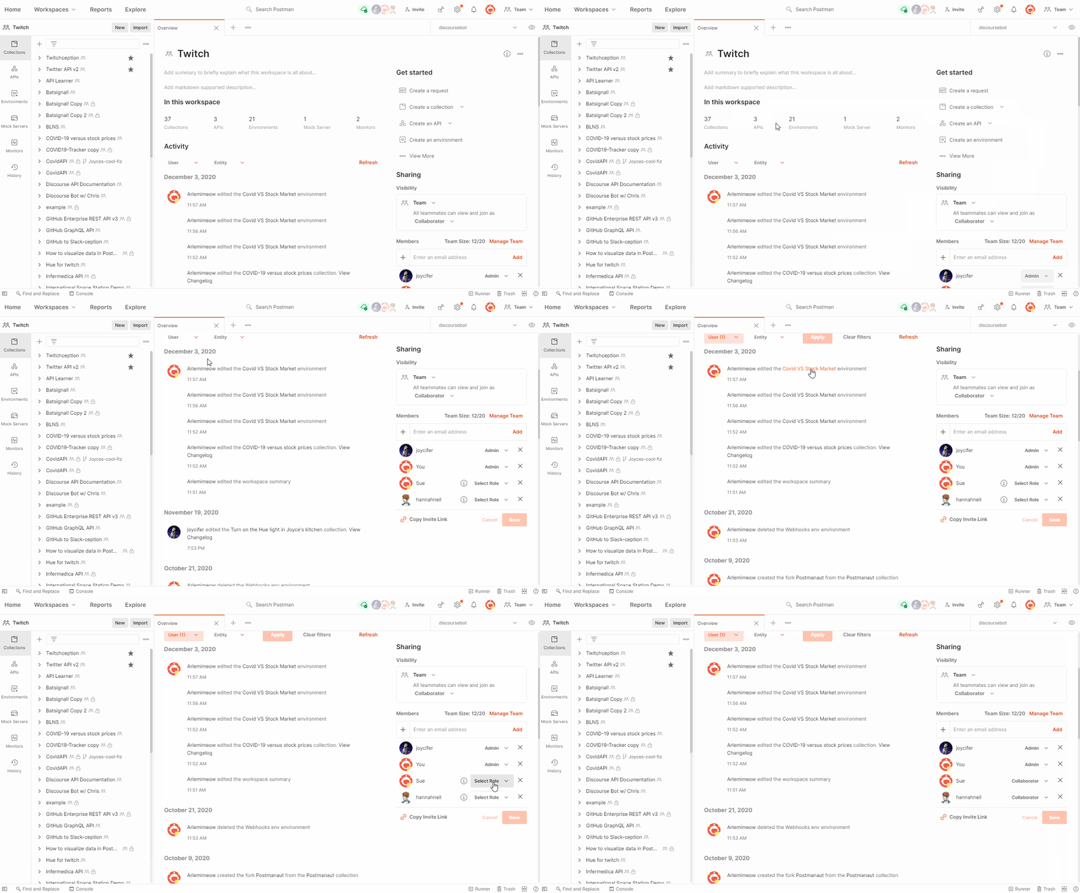
- Workspace Overview page is where you can navigate to everything in your workspace: Workspace in Postman is where you and your teams can work collaboratively in real time. We have introduced the Workspace Overview page, which gives the current state of the workspace and the ability to navigate to all the things in the workspace. With the workspace activity feed, you can also see all the work that you and your teammates are doing in that workspace. It also lets you manage the visibility and members of the workspace in a single place. You can choose to make the workspace public for public collaboration or even share your personal workspace with your team in a single view.
- Postman’s full suite of products is now under a more consistent universal navigation: One of the things that we hear often from our customers is, “Oh, this feature is incredibly useful. I didn’t know you could get this done in Postman.” While this is extremely satisfying to hear, it also points to the fact that there were opportunities to drive self-discovery within the product. The latest version of the Postman desktop app brings a consistent universal navigation that matches the web experience and also makes it incredibly easy to discover different product features.
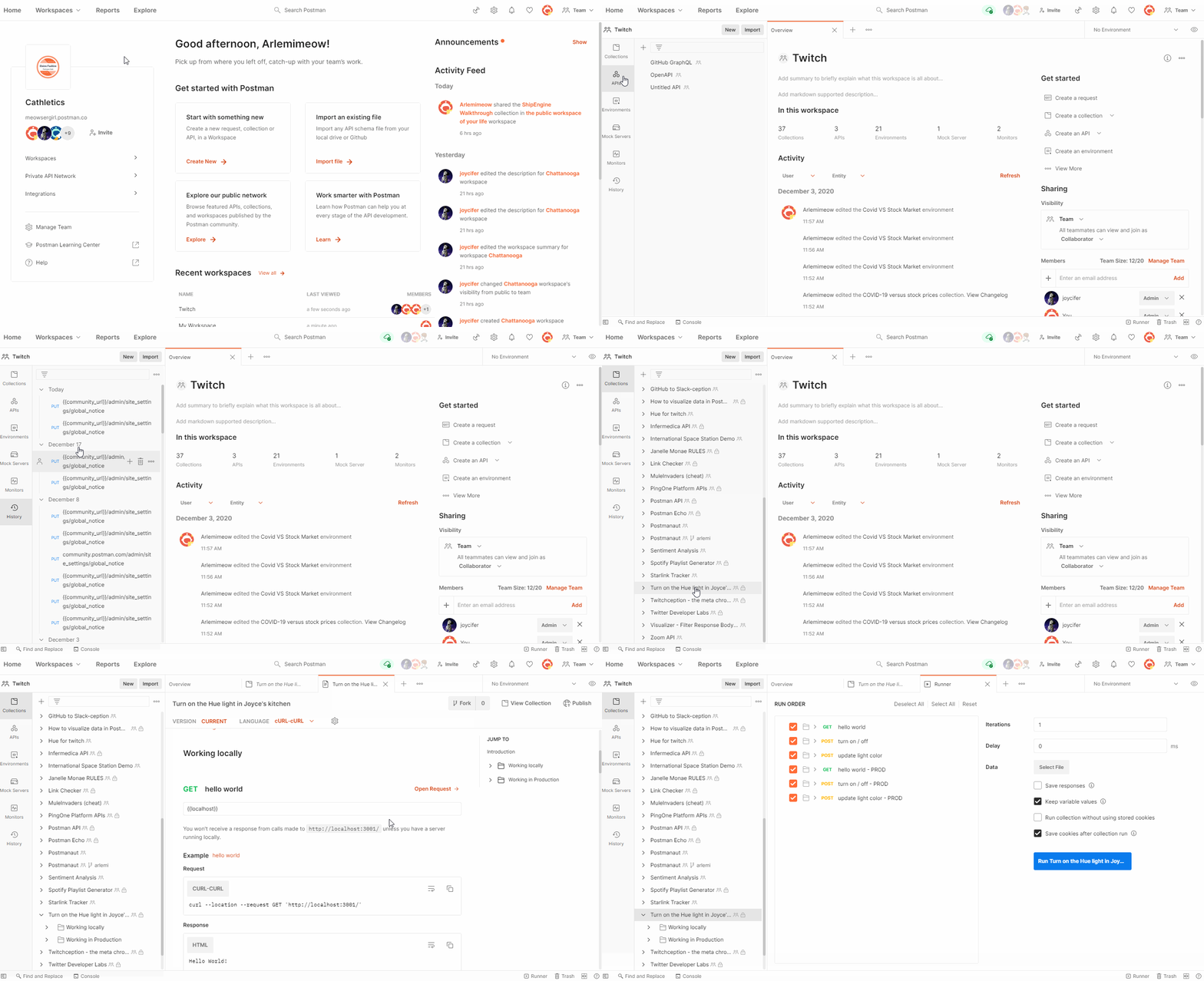
- Panes enable you to customize the Postman interface to match your preferred work environment: Components of Postman’s product interface have been designed to keep the requirement of concurrency in mind. You should be able to set up your workspace in the way that’s most efficient for you. Hence, the working area in the interface is now divided into what we call “panes.” These panes can be expanded and adjusted according to your unique preference, helping you focus on what’s important to you. You don’t have to fit a mold and neither does how you use Postman.
- An updated sidebar for workspaces gives you access to all your API data from one place: The new desktop app lets you access environments, mock servers, and monitors right from the sidebar itself. If you’ve already started experiencing Postman on the web, you might have also come across the relational sidebar. The relational sidebar changes the display and list items based on the main sidebar. It also functions as a pane, so you can increase or decrease its width based on your liking.

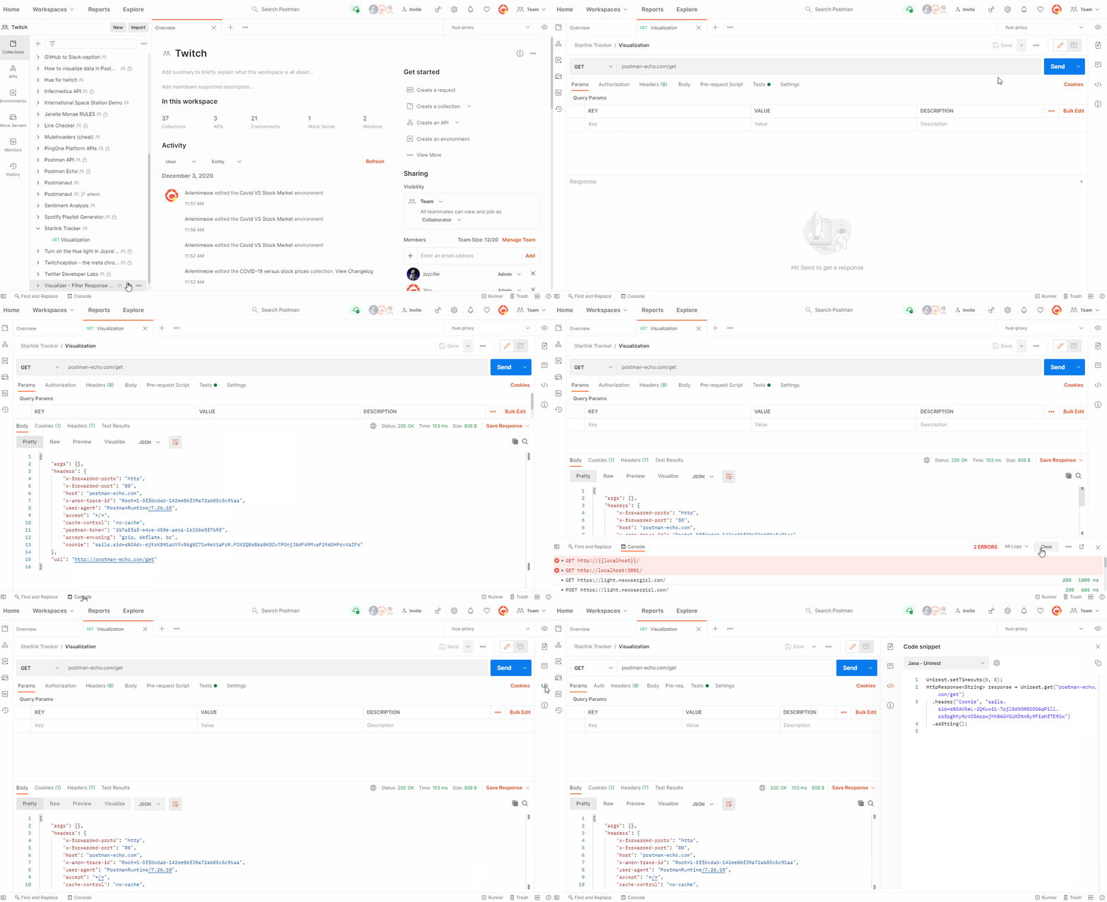
- There are now more entities in tabs so that they have better interfaces to author and run them: You can now access environments, mocks, monitors, pull requests, and documentation as tabs within your workspace. You can easily author or edit them in the tab, which significantly enhances the experience of working with these elements over different pages.
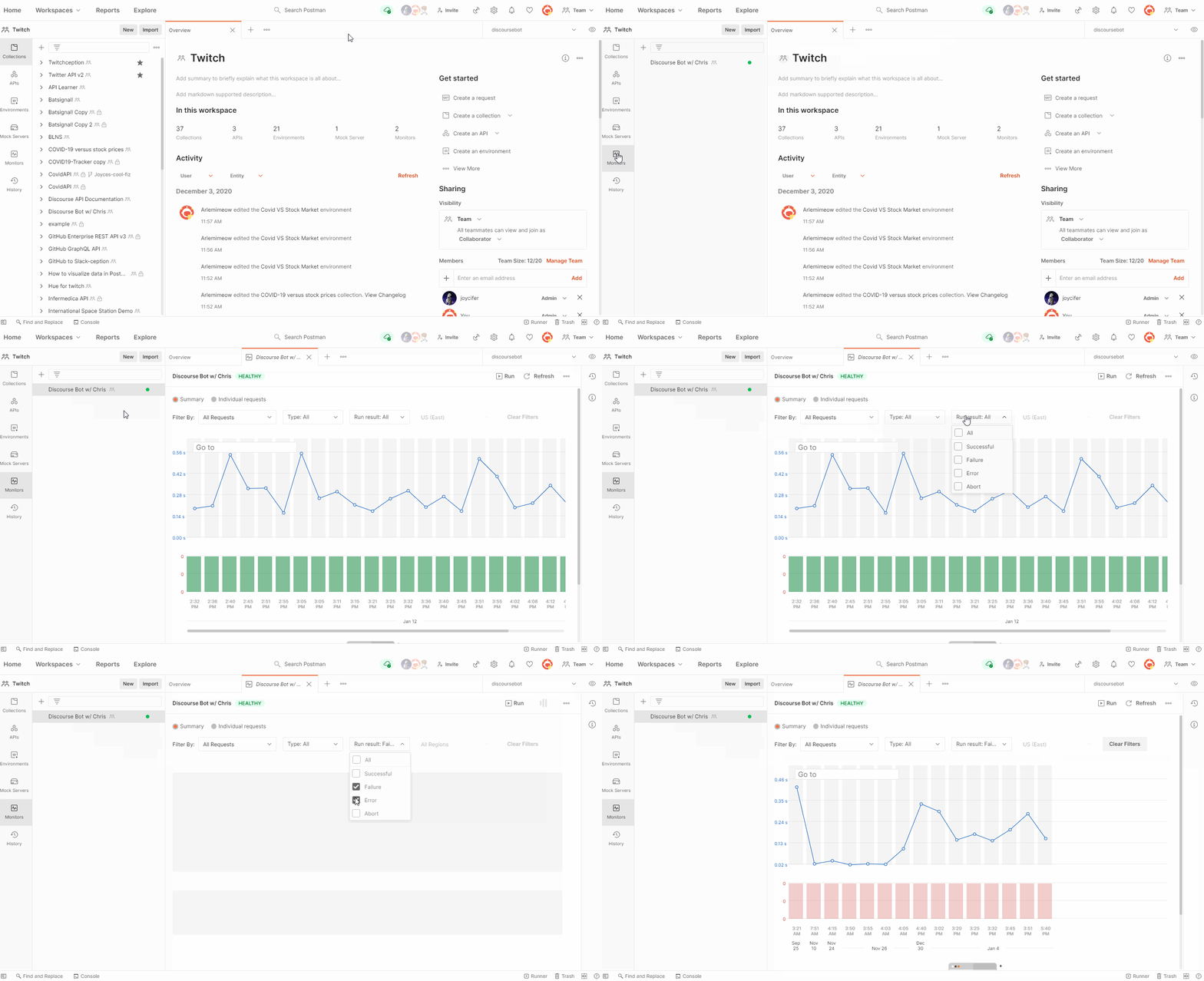
- A context bar provides information relevant to the item you’re viewing in a workspace: The new context bar, which replaces the collection browser, is a lifesaver and one of the things we love about the new design. Say you are working on managing your entities in your CI/CD pipeline with the Postman API. Before, you would have to use several API calls to find the entity IDs. Now, you can find them directly in the context bar of the new user interface. You can access documentation for the entity you are working on, see pull requests and forks relevant to a collection, or view code snippets for requests right from this bar. Below are just a few examples, so please explore these in the product and let us know what you think.

Search the universe of APIs with universal search
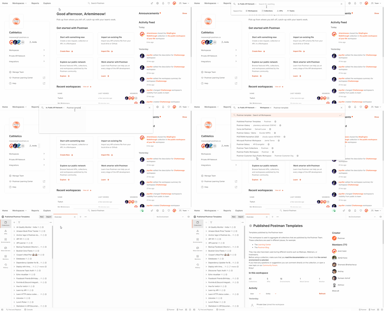
Another important update to the desktop app is Postman universal search. Universal search makes it incredibly easy to search and discover any private or public API element. You might be looking for something specific or just exploring a particular topic. Whatever your use case might be, universal search looks through all API elements in your account, the private API network, and the public API network to help you get started in a few clicks. Here are a few notable things about universal search:
- You can filter by type of API element: By default, universal search searches through all elements—workspaces, collections, APIs, users, and teams. Still, you can filter the type of element you are looking for in the search. The search algorithm looks through the name, summary, and description of all elements. It also looks through the folders, requests, URLs, and examples in a collection in order to give API consumers more relevant and useful results. If you are an API producer, having these elements updated and well documented will help you in driving better discovery of your APIs with a community of 14 million (and growing).
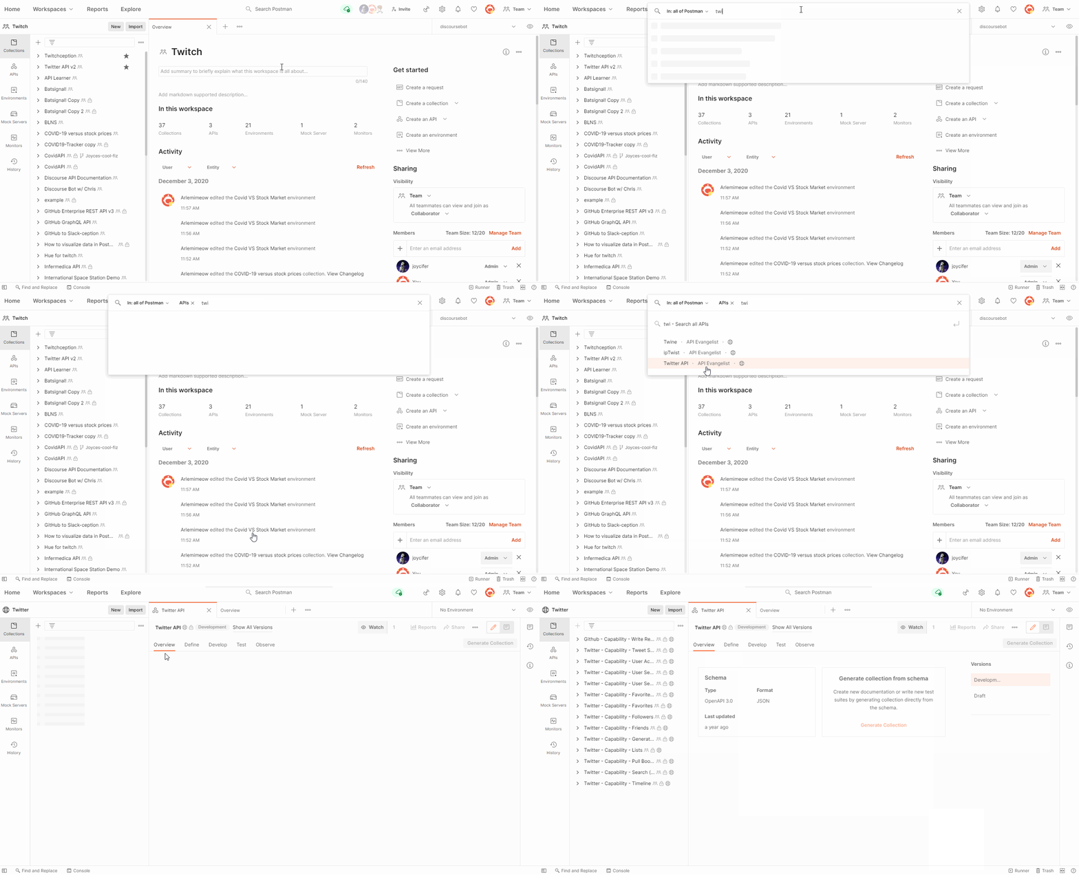
- Search suggestions help when you don’t know what you are looking for: Universal search will show you suggested results as you type your search query. You might be looking for “Twitter API” but don’t know its exact name, so universal search enables quick discovery by giving you suggestions as you type. The search will also give you results across all types of API elements—workspaces, collections, APIs, etc. to help you find the resource you are looking for.
We always try to present information in a manner that is consumable to our users. Keeping that in mind, we have restructured our view to create better consistency in our UI. With this latest update you will see these changes:
- The Runner button: This used to be on top and opened in another window, but is now in the bottom right and integrated with the main app. This is done to deliver an integrated user experience so that you can build your collection runs faster without any switch in context.
- The workspace navigation: This used to be in the center, but is now to the left so that navigation is clear and consistent for you. This workspaces list is also made smarter—keeping the most relevant workspaces closer and visible to you, while the rest of the workspaces are a filter or search away.
At Postman we are obsessed with making it easier to build, discover, and use APIs. Once you update or download Postman v8, we hope you’ll love the new desktop experience as much as we do. The new version will be rolled out to all users in the next few weeks.
Please send us your feedback on what we can do better by reaching out to us on our own Postman public workspace, GitHub, Twitter, Community forum.
Can your reorder Examples in v8?
Hi there, Examples still populate in the order they were created and it currently isn’t possible to reorder them in the UI. But we do have an open Github feature request about this that you can subscribe to for updates here!
Thank you. Indeed, Git request has been open since May 2015 with a passionate following on the topic. And missed commitments to deliver in 2020. Can you please finally make this happen.
wo kann ich meine lokalen Workspaces finden? Im Menu Workspaces fehlt mir der Switch für loacal und team, somit habe ich keine Möglichkeit mehr auf meine lokalen Workspaces zurück zugelangen, das ist mehr als kontraproduktiv.
Hi Joachim, Please contact our support team at http://www.postman.com/support and they’ll be able to help you. Danke.
The application feels a lot snappier overall, are you still using Electron for the UI layer?
Hi Mike, Yes, we’re still using Electron.
Your v 8.0.3 has messed with specific processes that I do, the proxy settings suddenly don’t work like they used to, what’s up?
Hi Jed, Please contact our support team at http://www.postman.com/support and they’ll be glad to help you.
In the other version i had the number of request in a collection, I can’t find that info in this version, where is it? thanks!
Hi Gabriel, This has been removed from the collection view but we’re looking at different options to present the data in the v8 UI.
what font do you use for the interface? I really like it
Hi Andrew, So glad to hear you like it. We use Inter font.
Hi, guys how do you post docs with new interface can’t see the option for it
Hi Serhii, The “Publish” action is located in the top right section of the Documentation tab. Access the Documentation tab by clicking “View complete collection documentation” at the bottom of the Documentation section of the collection’s context bar.
From where I can know the no. of requests in each collection in the last update
Hi Heba, This has been removed from the collection view but we’re looking at different options to present the data in the v8 UI.
Is there any way to disable the Examples. It is distracting to see multiple entries when you click on an API.
Hi Ramesh, Clicking on a request in the sidebar will always expand it to show all examples that exist for it. You can technically click the caret (the little arrow) next to the request to collapse it so that you don’t see the examples, but you’ll have to do this each time you click a request.
I used to be able to right click on a route and click edit description. Now it just says ‘View Documentation’: Where I have to scroll through 35+ routes to find the one I want to update. Is there a solution like the old way that I’m missing?
Also, like others have mentioned, having the number of routes in a collection back would be nice.
Anyway, apart from that, thanks for the great app 🙂
Hi Scott, If you open a request in a tab, you can now click the documentation icon in the context bar (rightmost bar on the screen) to show the description for that request. This is where you can add descriptions. As for the count of requests, that’s something we’re working on and will be bringing back in the next couple of releases.
It would be really nice if you have a compact version of this UI
My 1920×1200 monitors are set in portrait mode. The desktop app width is responsive… down to about ~1300 wide. So the Send button is just barely off-screen. In settings, I cannot see any way to adjust. Did I miss it? Or is there another [secret!] way to configure this?
If not, please consider making the min width a skosh narrower in a future release. Thanks!
You can collapse the sidebar by dragging it all the way to the left. You can also hit Cmd + – to reduce the screen magnification, which will ensure that the button stays in view in the smaller size as well. But thank you for the feedback; we have some initiatives planned around better responsiveness. Stay tuned for updates.
Is there an option to return the old ui back from the settings? I really dislike this new ui. Sure it looks more modern but a lot of tiny tweaks are missing which quickly gets annoying. Like the most annoying this right now is that I hate having the workspace menu open, although I use it often. To close it after opening the damn menu I have to resize it, which seems like a retarded ui decision.
Hi Silva, There’s an icon in the bottom left of the UI that allows you to collapse the sidebar. You can use that to hide it in one go. We’d love to hear more about why you feel the UI isn’t working for you. You can report issues/feedback to our GitHub repository here.
After the latest Update to 8.08 the UI does not show up the collections or any window. It simply shows grey screen. Appreciate if you can suggest how to fix this
Hi Jameel, Please contact our support team at http://www.postman.com/support and they’ll be able to help you debug this.
Hi. I can save multiple response examples and view them in the app, but the published documentation only show one example which is the first created one. How can I set the documentation so it will show all the saved response? thanks
Hi Jap, In the documentation, you can click the example name to open a drop-down that will allow you to switch between all the available examples for a particular request.
Hello is there any way to get the “old” navigation layout.
Thanks for your very informative blog.
For me there is only one issue. The UI is hardly readable on my 4K screen. I have to move the app to my notebook screen with a (system) text scaling factor of 1.25 to be able read text sth.
Font change in settings does not change anything.
Do you know a solution? (Ubuntu 21.04)
Thanks.
Slow, heavily abstracted and overly complicated for simple CRUD testing. Good for your first hello world app, but any serious coder should steer away from Postman.