Building Developer Interfaces That Scale: Growing Panes
Over the last couple of years, Postman has grown from a simple REST client to a complete API platform with a solution for almost every workflow involving an API. As our product has scaled, we’ve had to balance providing robust functions with ensuring that our tools remain simple enough for people to learn and master. To keep this balance, we’re committed to making the Postman experience more and more intuitive by building relational interfaces.
As a director of UX design at Postman, I like to think of a relational interface as one in which every part of the interface has a distinct purpose and relationship with its neighbors. While this sounds straightforward enough, developer tools can require pretty complex interfaces because developers expect a lot of flexibility and customization. Different work patterns might require different layouts to optimally complete the work in the fastest time possible—and at the end of the day, everyone wants to get their APIs up and running quickly.
Let’s look at one key interface element that enables efficiency when using Postman: panes.
Introducing panes: same data, different views

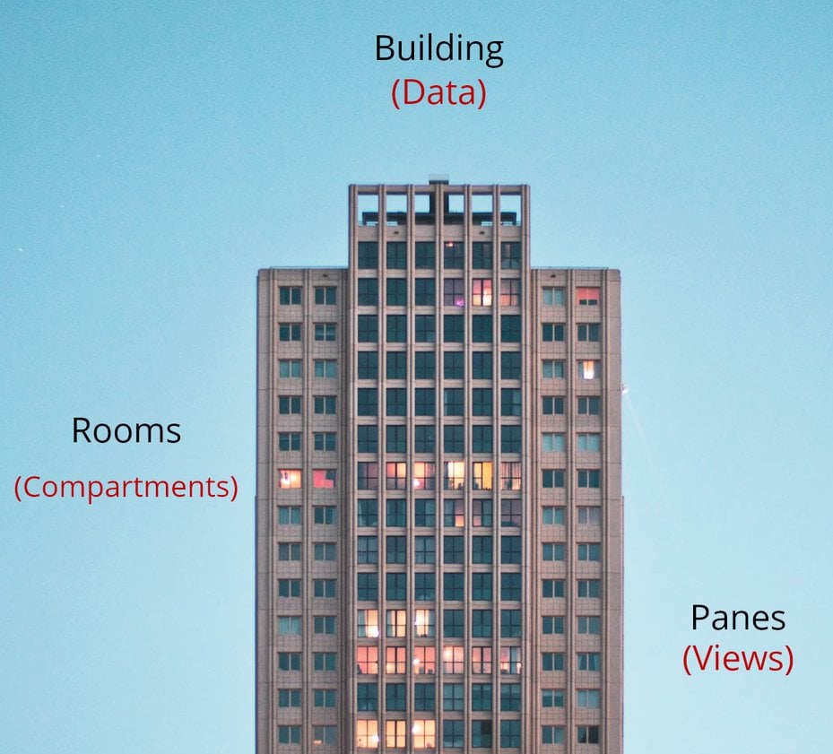
We like to think of panes as views into your data. If a building represents a set of data and its rooms represent different compartments or classifications of that data, panes are the windows that let you view these rooms. Now imagine you can resize, expand, collapse, and snap those views to suit your needs. That customization is exactly what panes allow. This enables Postman designers to optimally represent and arrange data to best serve our users who are consuming it. And if you ever feel that a particular layout doesn’t fit your need, you can always customize it to better support you. Our team has been working on implementing this for some time, and we’re excited to now offer increased flexibility with panes.
How the ideas of concurrency and relational interfaces influence Postman panes
Panes, by themselves, are just building blocks in a bigger scheme of things. A cornerstone of our thinking around panes was how we can utilize and combine them to create meaningful layouts. That’s where concurrency comes in.
In programming, concurrency is usually referred to as the ability of different parts of a program to be executed out of order or in partial order, without affecting the final outcome. As a concept, this has a rather interesting application in user experience, where concurrency can be thought of as the ability of a user to execute different parts of a job or task in any order, without affecting (but hopefully speeding up) the final outcome.
Whenever Postman designers build experiences, we try to ask ourselves if the interface provides enough information for users to work concurrently on different parts of their task. Panes continue to be instrumental in how we can scale this approach to every interface we build in Postman.
However, optimizing for concurrency alone would result in interfaces that are great to work with, but incredibly frustrating to learn and understand. An approach we use for avoiding this pitfall is ensuring that any combination of panes we build supports a relational interface. A relational interface can then be an organized structure of panes following these three rules:
- Every pane has a distinct purpose.
- Every pane has a defined relationship with its neighboring panes.
- Every pane increases the concurrency of the interface.
A good example of this is the Postman Console. Initially, the console was displayed in a separate window, but now you can look at logs for your request transaction concurrently with the rest of your request and response—all within the same window. This principle also applies to comments made on a request, which now show up in a context bar for the request, so you can view the comments while looking at where it was made on the request.
In both of the above examples, panes increase efficiency: Related tasks are presented in one place, so you don’t have to move back and forth between screens to view related data.
What you can expect to see in Postman
With the latest Postman release, users can expect to interact with panes while sending a request and viewing a response. This allows you to resize the request and response information to a size that fits your requirement. You can also collapse these panes when they aren’t required. But this is just the beginning. We’re investigating the use of panes across our entire platform experience, even conducting experiments around detaching panes to further empower users.
Feedback from our incredible community is essential to refining design, so we’d love to hear from you about what you’d like to do with Postman panes as we continue to evolve. Sign up to participate in our Postman UX Research Program or submit ideas through the channels listed below.

What do you think about this topic? Tell us in a comment below.