5 ways to enhance the developer experience with Postman Flows
Humans are hardwired to interpret meaning from images. To such an extent, that the human brain processes images 60,000 times faster than text.
Like I say, a picture is worth a thousand lines of code.
For API providers, a visual representation of an API workflow can be a more effective and interactive way to educate both technical and non-technical users about the capabilities of their APIs. Since the announcement of Postman Flows earlier this year, API providers have utilized Flows within their teams. Some, like Amazon, have even shared examples in their Postman public workspaces.
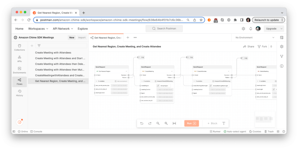
We have previously learned from the “Top 25 API onboarding experiences” blog post how to achieve a faster time to value. Now, let’s optimize the developer experience when it comes to using Postman Flows.
5 ways to optimize your Postman Flows for easier API adoption
So you’ve created a Postman Flow, and you’re excited to share it with your team or the broader API community? Here are five ways to squeeze more juice out of this fabulous canvas.
1. Write descriptions
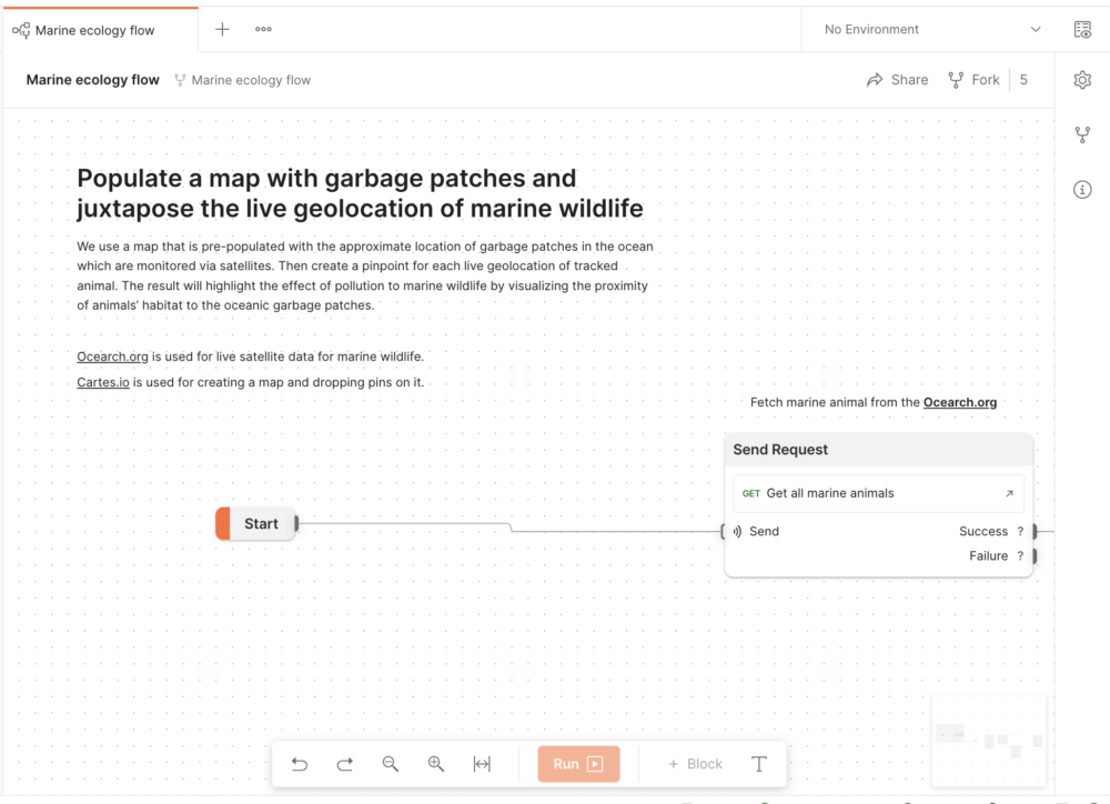
Don’t just rely on the blocks to show users a workflow. Supplement the Flow with concise instructions on how to get started and include annotations at known areas of complexity.
- Text: You may already know that you can add descriptions to your workspace, collections, and requests. But for Postman Flows, add a “Text” block directly on the canvas to provide context throughout the workflow. For example, if credentials are required to get started, provide a link to where API access can be granted.
- Summary: Add a brief summary for your Flow under the Info icon of the context bar on the right. This informs the Postman search results and also displays on your team profile page.
2. Leverage formatting
Leveraging the formatting options reduces cognitive load for first-time viewers and makes complex visualizations easier to comprehend.
- Groups: Group similar requests together, for example, to delineate a specific part of the workflow. Each group displays in the left sidebar as well as the minimap at the bottom right, so users can see and jump to the section quickly with a single click.
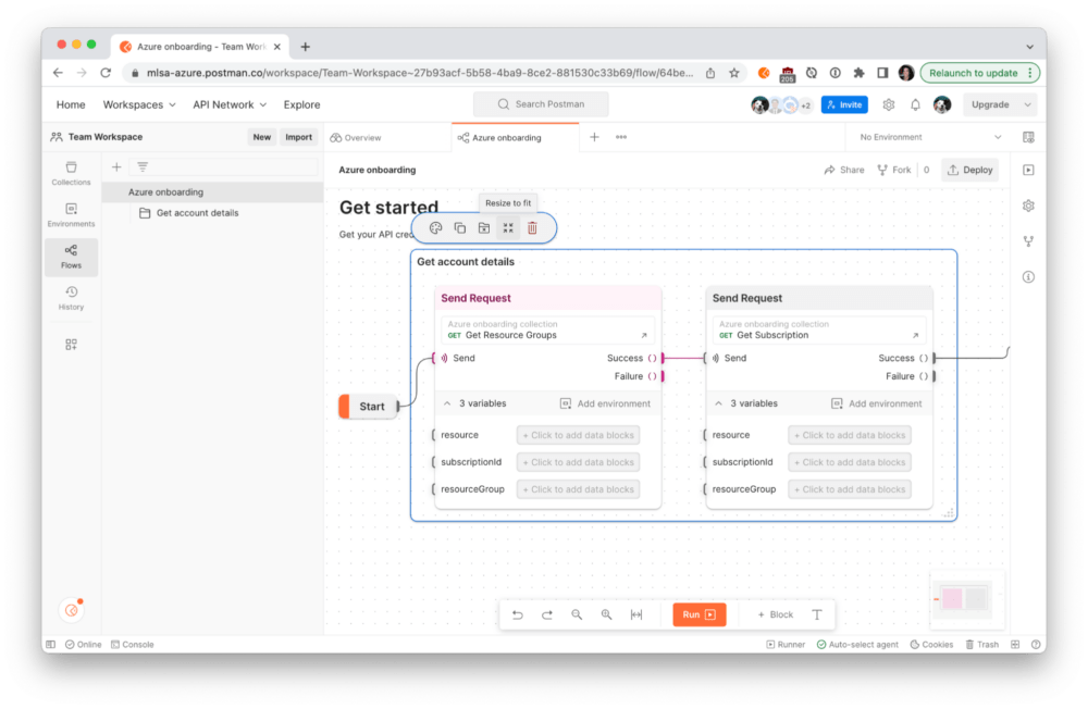
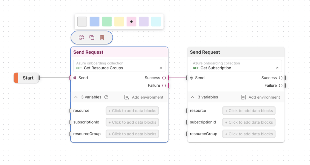
- Color: Select each block (or group of blocks) to update the accent color. This color-coding is also reflected in the minimap to provide a high-level orientation of the canvas.
3. Insert blocks for visibility and observability
As the Flow runs, you can see execution moving from block to block. But what happens when something goes wrong, or the Flow finishes running? Providing feedback for the user to see what’s happening is an important step in building your Flow.
- Log: Add “Log” blocks at strategic places throughout your Flow to enable debugging and visibility within the Postman console. The console is also a good place to see network calls and raw data from requests and responses.
- Output: Add “Output” blocks at strategic places throughout your Flow. Some Flows use output blocks as an integral part of their project, such as to display calculated or retrieved results on a graph or in text. For others, a strategically placed output block lets the user understand what’s happening as the Flow runs from within the context of the canvas.
4. Tidy up the canvas
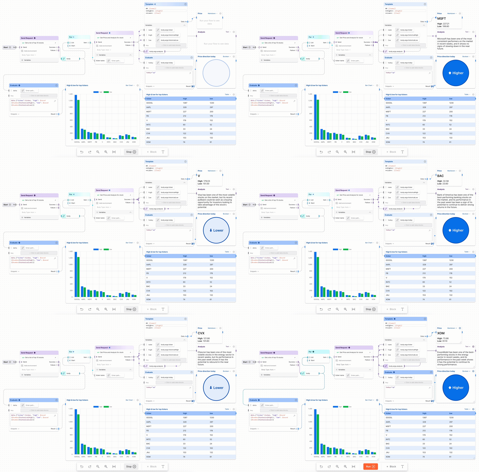
It’s important to reduce clutter and put your best foot forward if you plan to take a screenshot or record a gif for documentation or social media.
- Delete unused blocks or ones that are not relevant or required.
- Place blocks close enough that users can see each block and also the data moving between the blocks when the Flow is run.
- Within each block, collapse the variables section to abstract details or expand the variables section to explicitly show important elements of the request.
5. Clarify the call to action
Be explicit with your recommendations on what the user should do next. Don’t waste this opportunity to guide users and suggest next steps.
- Primary CTA: A common first call to action when navigating to a new Flow is to fork the Flow to their own workspace to try it out. This accomplishes the goal of teaching the user what’s happening, and can be enhanced by linking to relevant resources (such as gathering required credentials) and using the “Text” blocks we learned about earlier. Do not assume a user is familiar with these APIs or how to run a Flow.
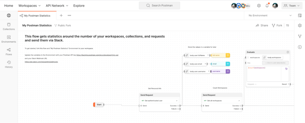
- Secondary CTA: Once a user understands the Flow, a secondary call to action can be anything you want. This allows the user to move from basic understanding to deepening their usage of the APIs. For example, once users experience their first taste of success, you can encourage them to deploy the Flow to run on Postman servers. If there are related APIs and endpoints the user can progress to next, consider adding that within a “Text” block.
Improve the business value of your APIs
These tips were especially selected to enhance the usage of your APIs with Postman Flows. Don’t miss these other ways to increase adoption and improve the business value of your APIs in Postman.
Let us know how you’re using Flows in the comments below. And if you think that you have a stellar public workspace, reach out to the Postman team at [email protected] so that we can validate your greatness and share it with the rest of the Postman community. Your API might even get featured on the Postman API Network.

What do you think about this topic? Tell us in a comment below.