
5 QE Pipeline Metrics That Show Where Quality Is Leaking

In the last post I described six problems that compound when development outruns the QE infrastructure underneath it. Most leaders recognize all six the moment I name them. The harder question is which one to fix first. That depends on where your pipeline actually leaks, and a framework without metrics is just a diagram on a wall. Here are the five I use, one per stage, each a leading indicator for the problems that surface downstream of it.
The five stages
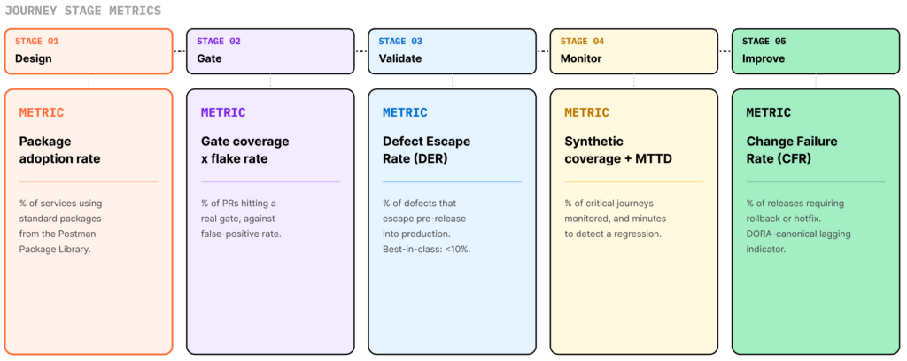
Every test artifact moves through the same five stages: Design, Gate, Validate, Monitor, and Improve. Most QE functions run Gate, because PRs have to merge. They run Validate if there is a pre-release window. Design tends to be manual and ad hoc. Monitor is usually endpoint pings rather than journey-level checks. Improve barely exists as a connected loop. One metric per stage tells you whether that stage is healthy or hiding a gap.
1. Package adoption rate (Design)
What share of your services have adopted standard test packages as a coverage baseline? Auth checks, error contracts, idempotency tests, pagination handling, schema validation, published once and consumed everywhere. A low rate means the function is not standardizing: coverage is uneven, the long tail goes undefended, and every team reinvents the same patterns and inherits the same maintenance. The best programs pass 80 percent adoption within the first year of a center-of-excellence rollout. Without an active package library, most sit below 25 percent.
2. Gate coverage and flake rate (Gate)
Two numbers, read together. Coverage is the share of PRs that run a suite able to block a merge. Flake rate is the share that fire false positives. High coverage with a high flake rate means engineers are muting or bypassing the gate, so it exists in policy but not in practice. Low coverage means there is no real gate at all. Read together, they are the best single signal of whether shift-left works operationally or only on slides. This is also where the AI throughput problem lands first: a suite that took 40 minutes was tolerable at one PR per developer per day, and it becomes a wall at five or ten.
3. Defect escape rate (Validate)
Of all defects found in a release, what share escaped pre-release validation and surfaced in production? The best programs hold this below 10 percent. Plenty of enterprise programs run at 30 percent or higher. This is where multi-protocol fragmentation does its worst work: a program validating only REST while production also runs gRPC, GraphQL, or async events reports artificially clean numbers, right up until a non-REST service has an incident. A weak Validate stage either stretches the pre-release window dangerously or collapses it, with teams skipping validation to hit a date. The metric says there is a problem. The stage says where.
4. Synthetic coverage and mean time to detect (Monitor)
What share of critical user journeys have synthetic monitors running end to end, not just endpoint pings? And when a journey regresses, how long before someone knows? Most monitoring I see is shallow, confirming that a service responds rather than that it responds correctly across the sequence of calls a real user makes. The best programs measure mean time to detect in minutes for critical journeys. Many enterprise programs measure it in hours, once a customer reports it. The space between passed pre-release and broke in production is where most escaped-defect stories live.
5. Change failure rate (Improve)
The share of releases that need a rollback, hotfix, or emergency patch. It is one of the canonical DORA keys and the slowest to move, because it is the consequence of every earlier stage working or not. When it rises even though your stage metrics look healthy, the problem is usually the Improve loop itself: failures triaged ad hoc, flakes muted instead of fixed, gaps spotted in post-mortems and forgotten by the next sprint. Quality compounds only when that loop closes.
How the pipeline reads diagnostically
The five metrics form a chain. Low package adoption means fewer gates carry meaningful tests. Fewer meaningful gates means more defects escape validation. That leaves monitors defending a surface they were not designed to cover, and change failure rate stays high no matter how hard the Improve stage works.
Read the chain in reverse to find the bottleneck. A bad change failure rate with high gate coverage points downstream, to Validate or Monitor. When everything downstream looks fine but defect counts are not falling, the problem is upstream, in Design or Gate. You do not need to fix all five at once. You need to find the one that is leaking.
Three outcomes leadership actually reads
The stage metrics are your diagnostics. Three cross-cutting outcomes are what engineering leadership tracks.
Lead time for changes, commit to production deploy, averaged across the portfolio. It compresses only when no single stage is the bottleneck.
Audit evidence completeness, the share of changes that carry a structured evidence trail produced as part of the work rather than assembled after the fact. A high score turns audit prep into a query. A low score keeps the quarterly scramble alive.
Toil reduction, the hours per quarter once spent on manual operational work that now runs automatically. In cost-constrained environments this is increasingly the number that justifies the investment: engineering capacity freed and redirected to product.
What to do now. Baseline all five metrics for one real domain, three to ten services where the QE pain is visible. You will not have clean numbers for all five, and that is the finding: the metrics you cannot measure are the stages you cannot manage. Start there. In Part 3 I lay out the three paths every QE leader considers, where each one hides its cost, and a 90-day plan to prove the model before you scale it. Want a second set of eyes on your numbers? Talk to a Postman expert.




What do you think about this topic? Tell us in a comment below.